![LOGO_WV-1.png]](https://help.martianlogic.com/hs-fs/hubfs/LOGO_WV-1.png?height=40&name=LOGO_WV-1.png)
Accessing ESS Branding Settings
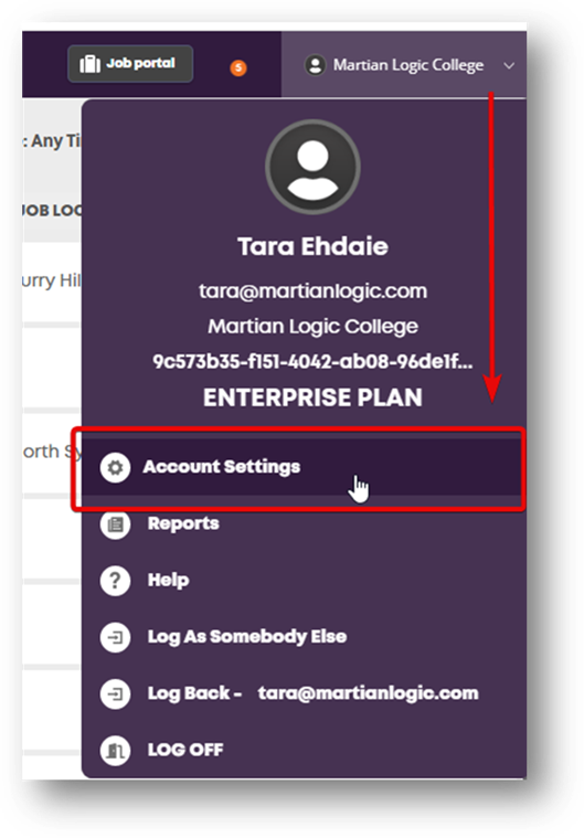
- Open Account Settings: Click your account profile menu in the top-right corner of the top navbar and select Account Settings.
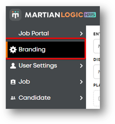
- Navigate to Branding: From the left-hand navigation menu under settings, click Branding.
Configurable Branding Features
The left panel allows customization of overall brand identity, logos, color themes, and navigation styles:
1. Entity & Display Name
- Entity / Division to Customise: Select the specific entity or child division to apply unique branding settings.
- Display Name: Enter the name displayed across the system header and portal interface.
2. Logos
- Platform Logo: Upload or change the primary logo visible on the top navigation bar, the ESS portal header, and the login page.
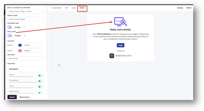
- Email Logo: Upload or change the logo rendered at the top of outbound email notifications.
3. Core Colour Palette
- Primary Colour: Set the main brand colour used for navigation sidebars, primary UI cards, and standard action buttons.
- Accent Colour: Set the accent colour used for highlights, dynamic status badges, and action buttons.
4. Side Menu & Advanced Overrides
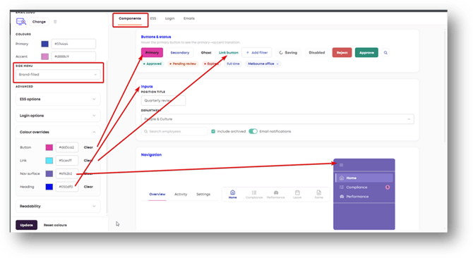
- Side Menu Style: Choose between predefined options like Brand-filled or Light to style the side navigation menu.
- Colour Overrides: Expand this section to specify granular Hex codes for specific interface elements:
- Button: Overrides standard button colors.
- Link: Overrides hypertext and link button colors.
- Nav Surface: Overrides side navigation background color.
- Heading: Overrides primary text and section title colors.
- ESS Options: Expand to toggle visibility for specific ESS portal modules (e.g., Leave, Compliance, Forms, Performance).
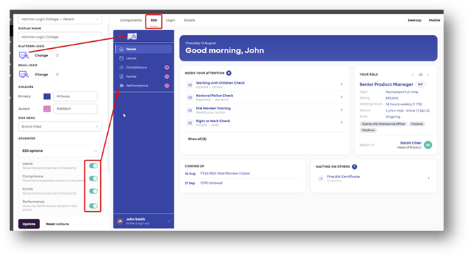
Live Preview Tabs
The right panel features live preview tabs allowing real-time testing of design changes across different user touchpoints before saving:
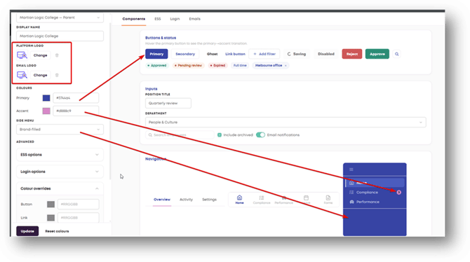
1. Components Tab
Previews UI elements under your selected theme:
- Buttons & Status: Test interactive states for Primary, Secondary, Ghost, Link buttons, input tags, and status labels (e.g., Approved, Pending Review, Expired).
- Inputs: Preview text input fields, dropdown menus, and search bars.
- Navigation: Review how the side menu renders with selected primary/accent colours and badges.
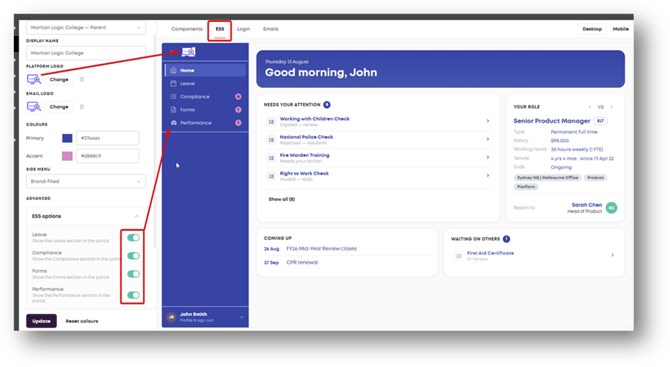
2. ESS Tab
Provides a full preview of the main Employee Self Service dashboard interface:
- Displays the live rendering of the Platform Logo in the top navigation.
- Shows side menu colour fills and navigation tabs.
- Displays real-time updates when toggling visibility switches under ESS options (such as showing or hiding Leave, Compliance, Forms, or Performance modules).
- Toggle between Desktop and Mobile preview modes in the top right.
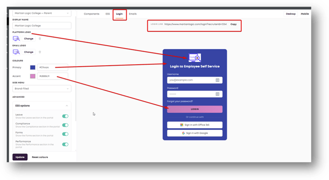
3. Login Tab
Provides a preview of the candidate/employee login screen:
- Displays how the Platform Logo, Primary Colour (background card), and Accent Colour (Login button) appear on the sign-in screen.
- Includes a Copy button to retrieve the direct portal URL.
4. Emails Tab
Previews outbound system notifications sent to employees:
- Shows the placement of the Email Logo at the header of system emails.
- Previews email action buttons styled with your selected primary colour.
Applying or Resetting Changes
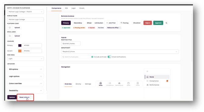
- Update: Click the Update button at the bottom of the left sidebar to commit and save your branding settings.
- Reset colours: Click Reset colours to discard colour customizations and revert back to default system values.